Logo
Tarter’s brand is a declaration to live honestly, work hard, support family and friends, nurture customers, be on the cutting edge of innovation, and honor tradition.
Our identifiable icon and wordmark represent those values, along with a hard-earned legacy, built on generations of strength, integrity, and trust.
Rationale
The Tarter icon is the signature of our brand. The icon stands strong and bold, taking on several deeper meanings to the past and future of our company. The custom wordmark takes a wide stance — representing the strength and tradition for which the brand has always stood. These two components can be used separately and together in approved lockups.
All logo formats will only appear in black, white, bluegrass, or a combination of these colors. White background applications will allow for black wordmark, blue wordmark, black icon, or bluegrass icon combinations. Black background applications will allow for white wordmark, blue wordmark, white icon, or bluegrass icon.



Icon
Our icon pays homage to our past branding in using the symbolism of the American flag through waving stripes. The four lines in the icon also represent the multi-generational ownership in the company’s past, present, and future.
Clear Space Requirements & Minimum Size
The clear space rule uses the height of the top two stripes from the brand icon around all sides of the icon placement to establish its clear space. This standard is intended to keep our brand marks within a non-competitive distance in relation to graphics, logos, borders, or images.
In order for the identity system to stay recognizable and legible, brand marks have a set minimum size for digital & print. It is essential to follow this rule to ensure the viewer can still read the marks and that they can print clearly.
Minimum size: Print 0.5” Wide, Digital 50 px Wide
Copyright: For icon only uses, the registered TM symbol must be used and the size is variable.
Wordmark
The Tarter wordmark is built from custom characters and can be used in instances where the lockup formats do not fit or in applications that allow for the icon and wordmark to be applied separately due to size, platform or design choice.
Clear Space Requirements & Minimum Size
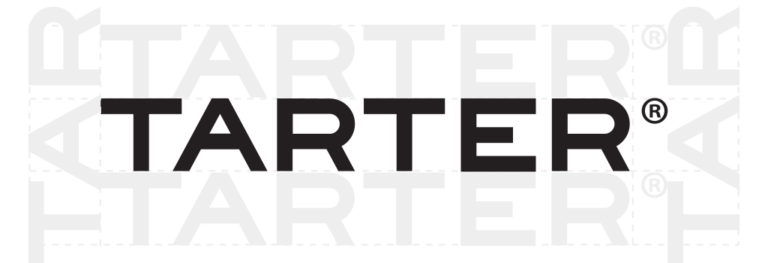
The clear space rule for the wordmark format should use the height of the wordmark itself as the measurement on all sides. Rotate the word mark around the lockup to get accurate measurements regardless of application size.
In order for the identity system to stay recognizable and legible, brand marks have a set minimum size for digital & print. It is essential to follow this rule to ensure the viewer can still read the marks and that they can print clearly.
Minimum size: Print 0.9” Wide, Digital 70 px Wide
Copyright: For logos where the name “Tarter” appears, the registered ® is used and size is variable.


Horizontal Lockup
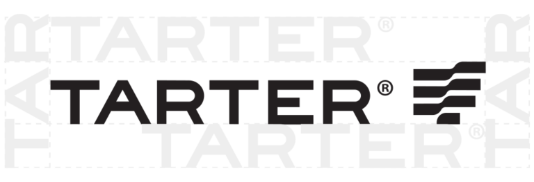
This arrangement is the default solution when using both icon and wordmark together. Both elements should be grouped at all times in this use.
All logo formats will only appear in black, white, bluegrass, or a combination of these colors. White background applications will allow for black wordmark, blue wordmark, black icon, or blue icon combinations. Black background applications will allow for white wordmark, blue wordmark, white icon, or blue icon.
Clear Space Requirements & Minimum Size
The horizontal lockup format should use the height of the wordmark as the guide for clear space. Rotate the wordmark around the lockup to get accurate measurements regardless of application size.
In order for the identity system to stay recognizable and legible, brand marks have a set minimum size for digital & print. It is essential to follow this rule to ensure the viewer can still read the marks and that they can print clearly.
Minimum size: Print 1.25” Wide, Digital 100 px Wide
Copyright: For logos where the name “Tarter” appears, the registered ® is used and size is variable.


Vertical Lockup
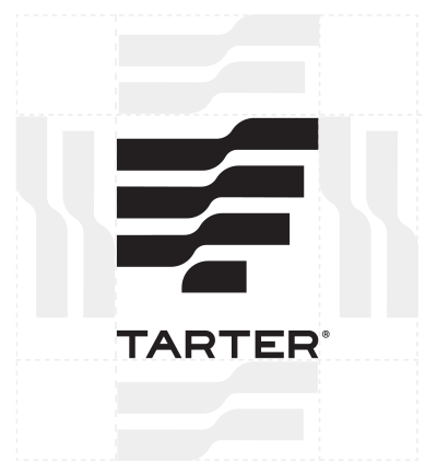
The vertical lockup can only be used in print or digital uses when the spacing allows or forces for a vertical or square format – such as on products or apparel.
Clear Space Requirements & Minimum Size
Like the icon format, the stacked format uses the top two stripes from the brand icon around all sides of the icon placement to establish its clear space.
In order for the identity system to stay recognizable and legible, brand marks have a set minimum size for digital & print. This is important to ensure the viewer can still read the marks and that they are able to print with little bleeding.
Minimum size: Print 0.6” Wide, Digital 50 px
Copyright: For logos where the name “Tarter” appears, the registered ® is used and size is variable.
